UI Design
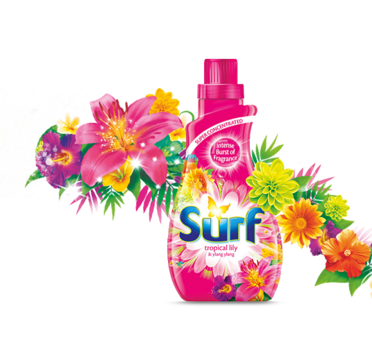
Surf.com
Project Details
My role: UI Design
Client: Unilever
Year: 2017/2018
Tools used: Sketck, InVison, Photoshop
Info
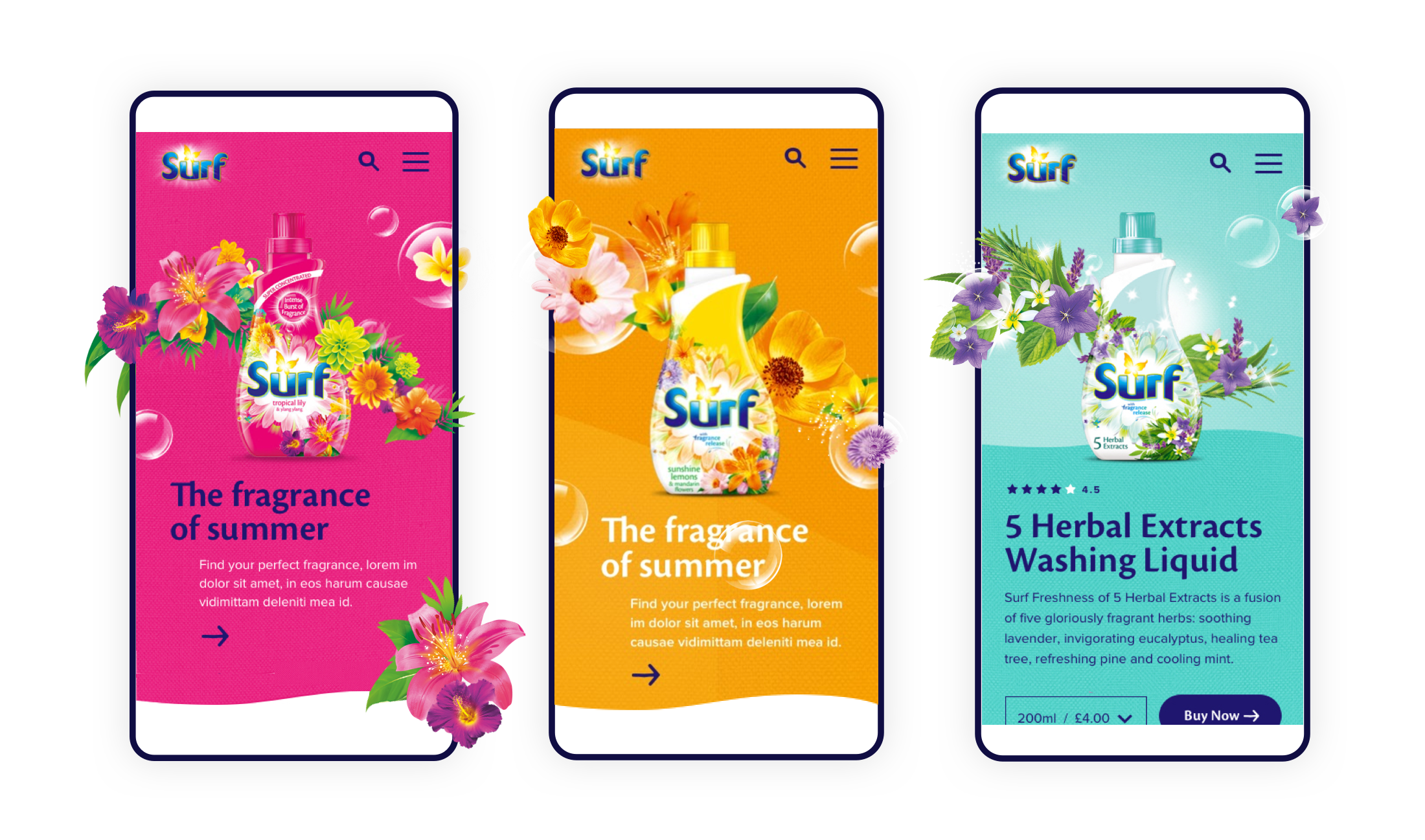
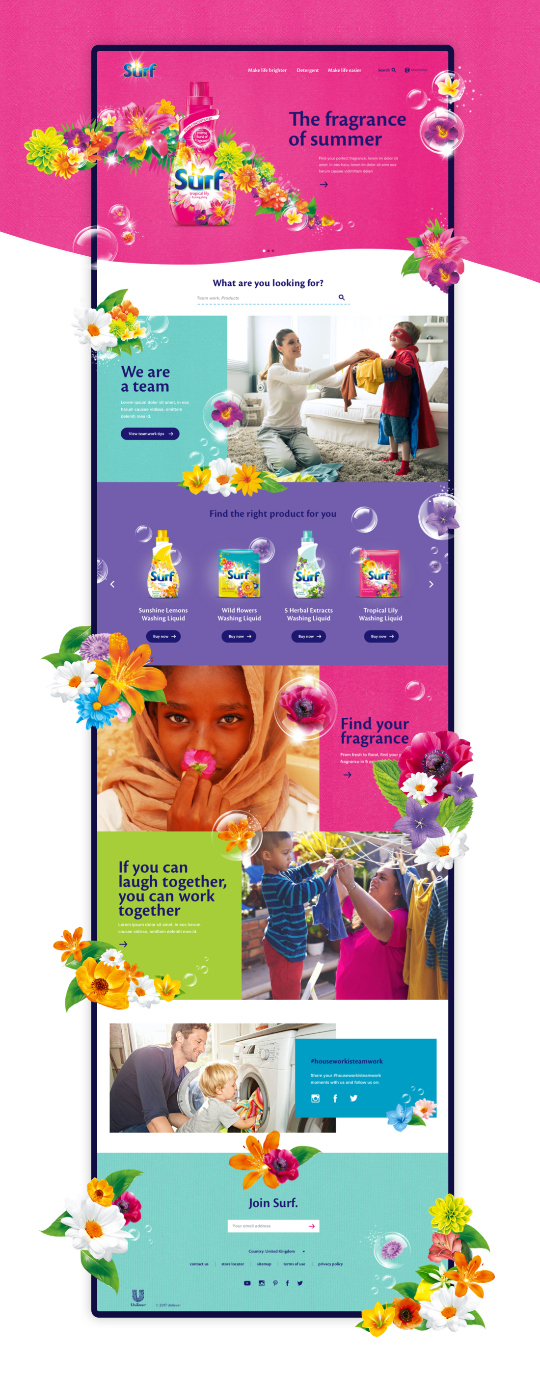
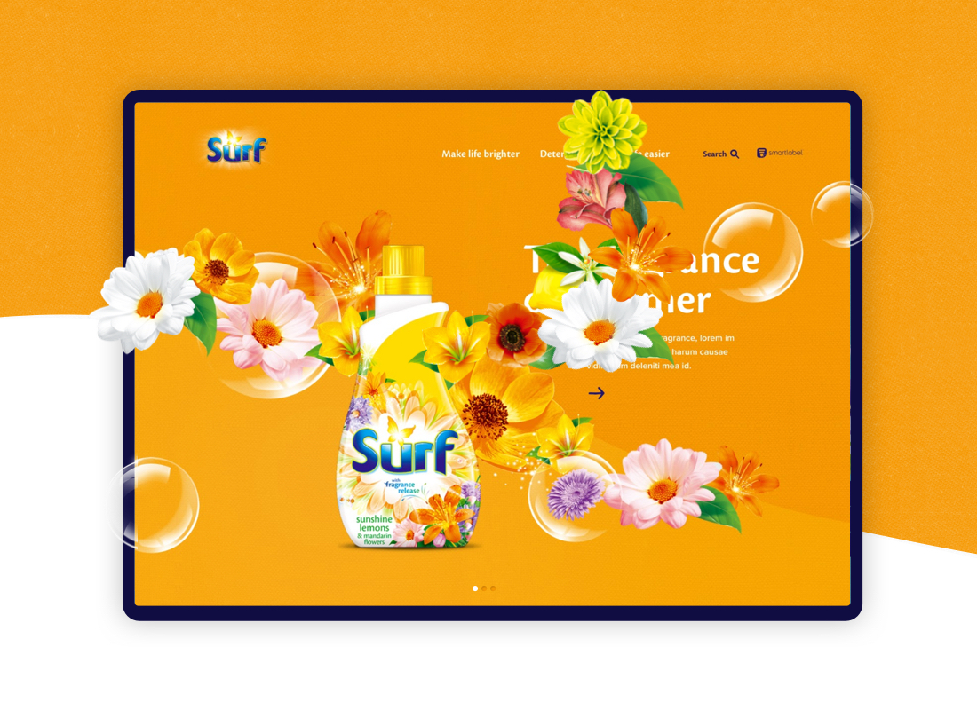
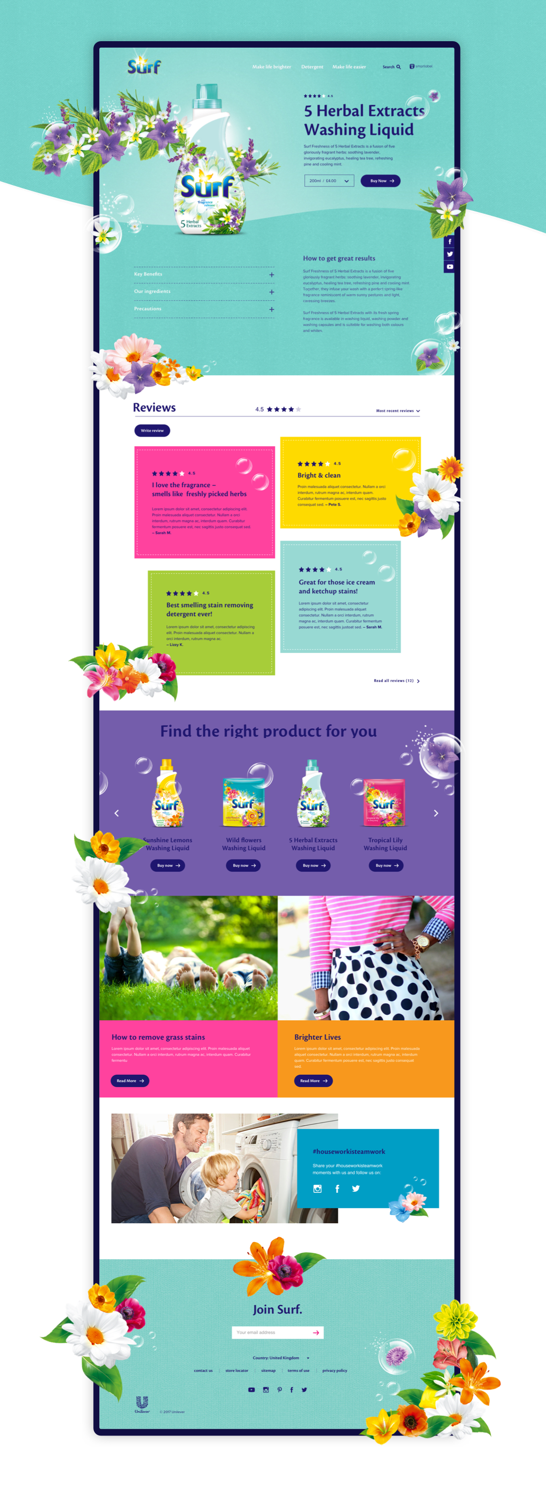
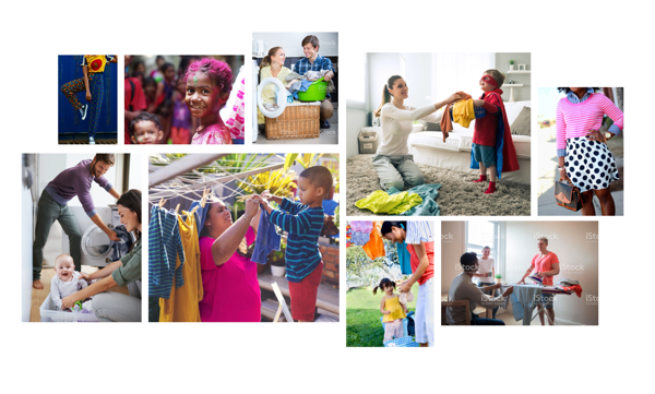
This case study shows the refresh and redesign process of rebranding Surf laundry detergent Global website.
Differentiating against competitor brands.
There is a clear opportunity to create visual differentiation for Surf by moving away from the generic strategies that competitors use when designing and building brand websites.
Developing the Surf Brand
Bright colour and illustration are how Surf has displayed its key brand qualities: full of life and playfulness.
The new website should retain this feeling of life and brightness, but move closer to the brand identity by rooting design, photography and illustration more in the real world.
Landing purpose in Brand.com
The Surf purpose vision is not yet fully finalised. We do know, however, that it will centre on the principle of lightening the load for women.